11 things to remember while creating a mobile friendly website
Most of your customers and prospects would be viewing your website through their mobile devices.
Moreover, with its mobile friendly update, Google has made it clear that it will be giving more importance to websites that display well on mobile devices in its search engines result pages.
That means, if your website is not optimized for mobile devices, then you are more likely to lose out on a large chunk of website visits.
Here are some things to remember while creating a mobile friendly website.
1. Use responsive design – The most important thing that one must do while creating a mobile friendly website is to use responsive design. Your content and design will be the same, but the way in which the website is displayed and arranged will be based on the size of the screen.

Responsive design has become a norm in the world and any website that isn’t responsive will never make the cut.
2. Make information easier to find – Visitors come to a website seeking information and you must make sure that visitors are able to find the information easily.
They must not be wasting their time looking for the information they want. Navigating to the important information in the website through the mobile phone must be easy.
3. Never use flash – Flash is an obsolete technology and you must never use flash to show information in your website.
A flash website will be difficult to view through a mobile phone as neither android nor iOS devices support flash. And using flash could also hamper the speed of the website.
4. Make large CTA buttons – Clicking a button using a mouse pointer would be easy while you are visiting a website through your desktop.

However to click a button using your finger through a mobile device would be difficult if the buttons are small.
So while creating a website for mobile phones you have to make sure that you have large call to action buttons.
5. Optimize your images and CSS – You must optimize your images and CSS so that it won’t affect site speed or visibility.
If your images are too large in size, your website will take lot more time to download. So you must compress the images so that it won’t affect site speed.
6. Use large, standard fonts – To make it easier for users to read content in a website while using mobile phones, you must use large fonts.
Also try to use standard fonts instead of custom fonts for your website content. Some fonts are harder to read at different font sizes and hence you have to test with different fonts before deciding on a font.
7. Use simple designs – Complex website designs with lot of different functionalities and features may look impressive in a desktop.
But while viewing a website through mobile devices a visitor may better appreciate a simple website design where finding the information she is looking for is easy and comfortable to locate.
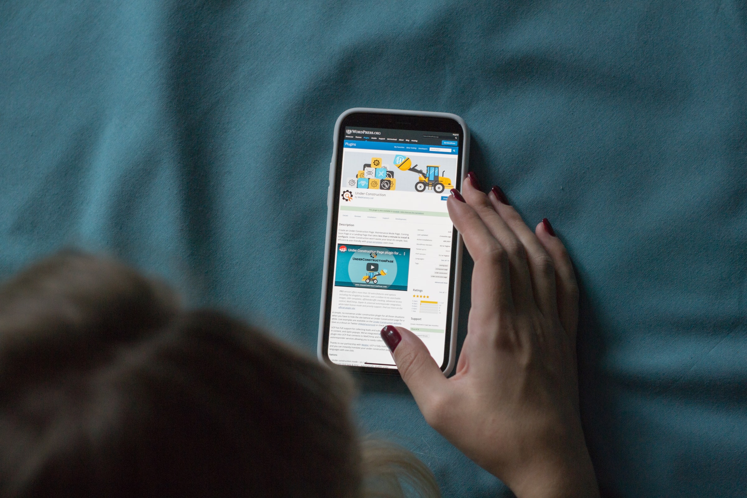
8. Use short forms – If it is important for you to include forms in website to collect user information, make sure that you ask don’t ask too many information from users.
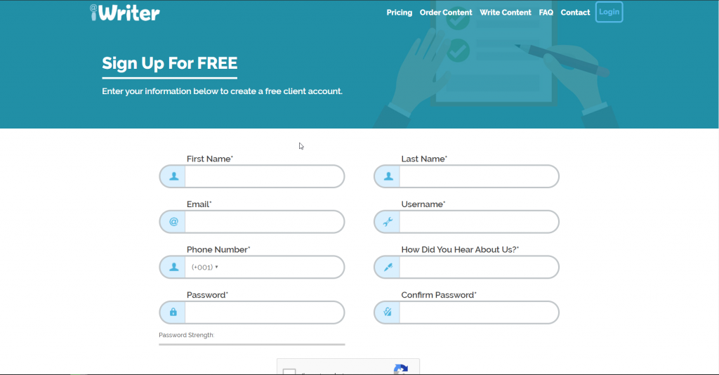
Ask only that information that is absolutely necessary for you, so that fields in a form are less in number. Visitors may not want to fill long forms while visiting a website through a mobile device.
9. Don’t use pop ups – Pop ups are generally considered as intrusive elements in a website.
Visitors don’t like them when they visit a website through a desktop device and they absolutely despise them while viewing a website through mobile devices.
So make sure that you don’t include unwarranted pop ups in your website.
10. Don’t use long sentences – Not many people like reading long sentences, particularly so when they are reading through a mobile device.
You must use only that many words that are enough to communicate the information you want to give.
Never overwhelm users with long content that are difficult to read and are insignificant.
11. Include search box – There must be an option in the home page itself to search your website information.
If visitors get lost inside the website, unable to find the information they are looking for, they can search and find them easily from the homepage.
Website development India team of Calpine Group has been helping businesses to come up with mobile friendly website. Contact us if you are looking to create a mobile friendly website.


